Process
A Tale of Two Acupuncturists
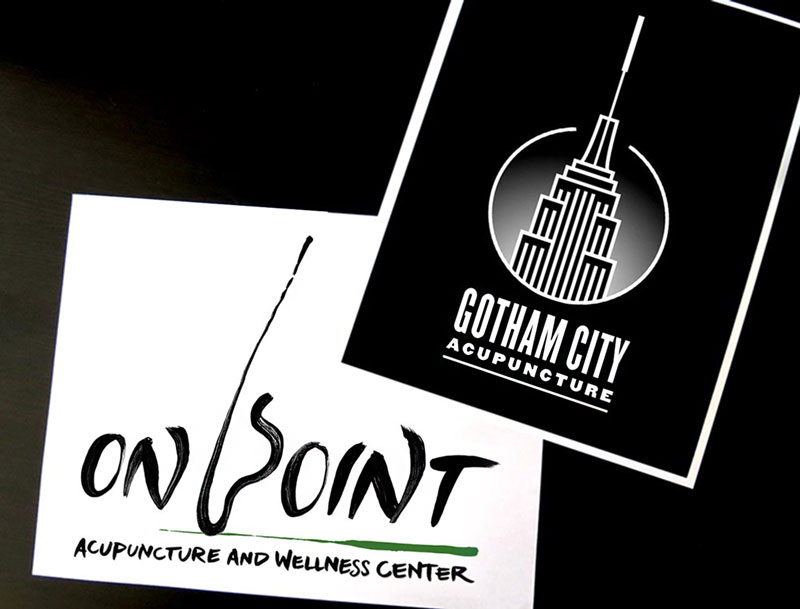
Two acupuncturists simultaneously hired me to revamp their branding. Here’s the decidedly different paths I navigated in order to represent each client’s unique professional style and personality.
On Point
Acupunture and Wellness Center
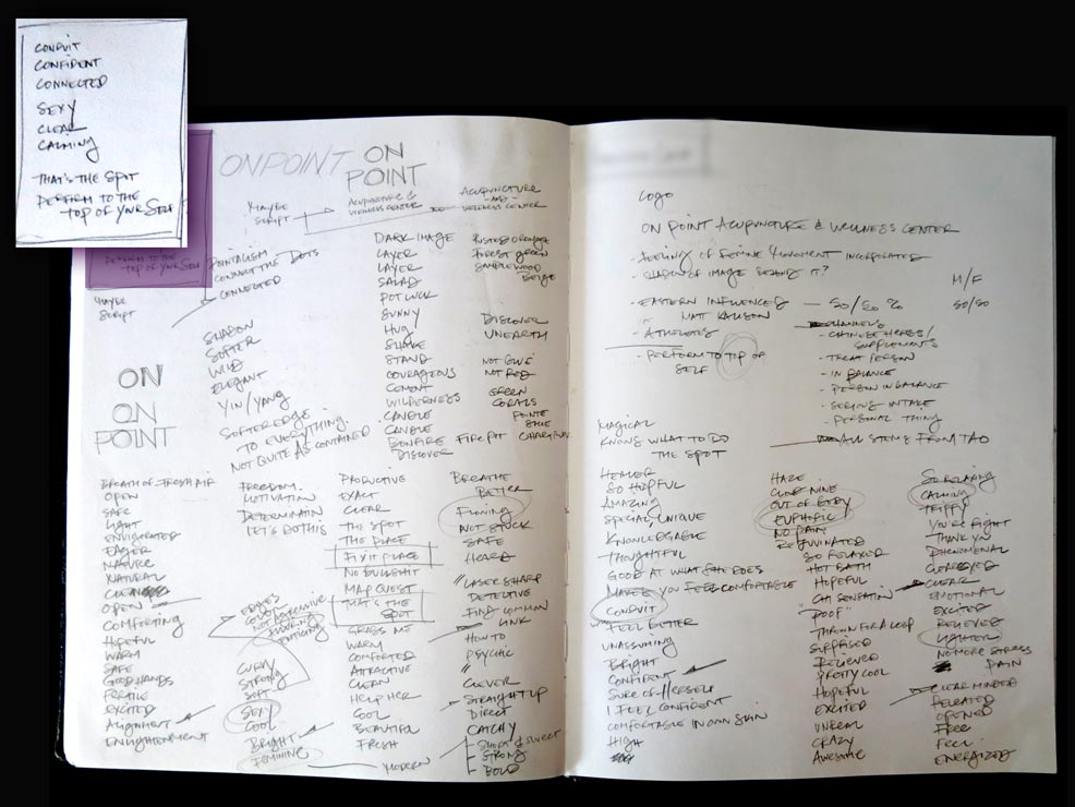
My process usually starts with a quick, comprehensive interview. I’ve developed a variable set of questions, prompting clients to reveal the unique essence of their project. Since successful advertising often means accessing subconscious desires / feelings / emotions, my questions produce results in the form of descriptive adjectives, creating essential words (highlighted, upper left) which guide our project as we move forward.
My process usually starts with a quick, comprehensive interview. I’ve developed a variable set of questions, prompting clients to reveal the unique essence of their project. Since successful advertising often means accessing subconscious desires / feelings / emotions, my questions produce results in the form of descriptive adjectives, creating essential words (highlighted, upper left) which guide our project as we move forward.
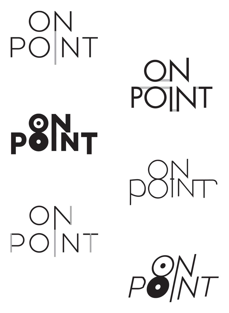
My first concepts based on our discussion. They’ve got movement, specificity and flair. However, they lack femininity and an essential personal nature that my client effortlessly radiates in her treatment room.
My first concepts based on our discussion. They’ve got movement, specificity and flair. However, they lack femininity and an essential personal nature that my client effortlessly radiates in her treatment room.
Gotham City Acupuncture
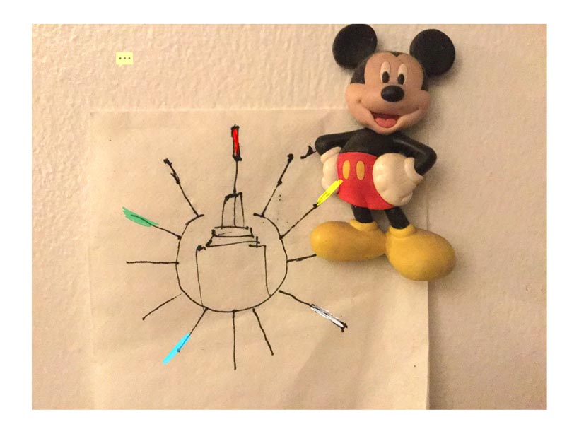

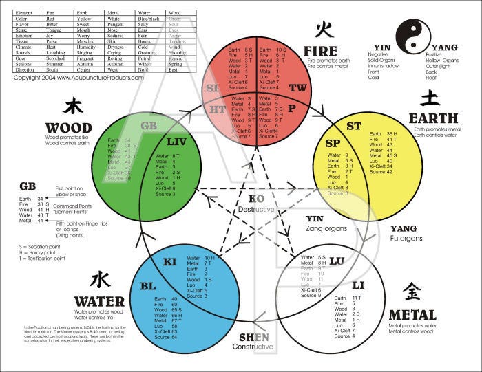
My client’s initial logo was created with clip art, so he was looking for some serious refinement. We discussed the project and I sketched an idea on a napkin. We set out to integrate the Five Elements – and their respective colors – into the design.
My client’s initial logo was created with clip art, so he was looking for some serious refinement. We discussed the project and I sketched an idea on a napkin. We set out to integrate the Five Elements – and their respective colors – into the design.
Initial / Previous Logo

Initial / Previous Logo
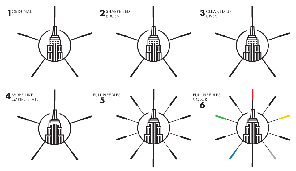
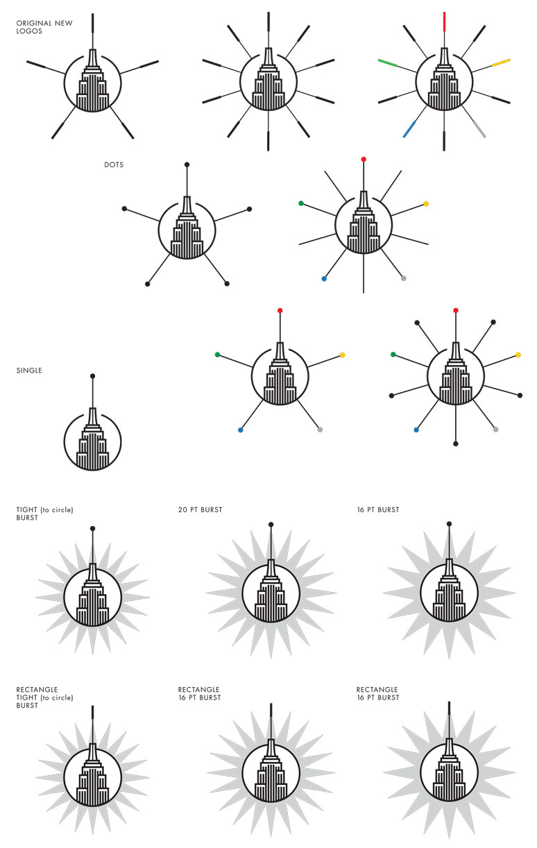
Gotham City refers both to my client’s location (midtown Manhattan) and his serious love of The Dark Knight (Batman). First up: refining and defining the central icon of the logo, The Empire State Building. Then I added our needle options.
Gotham City refers both to my client’s location (midtown Manhattan) and his serious love of The Dark Knight (Batman). First up: refining and defining the central icon of the logo, The Empire State Building. Then I added our needle options.

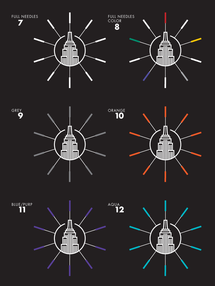
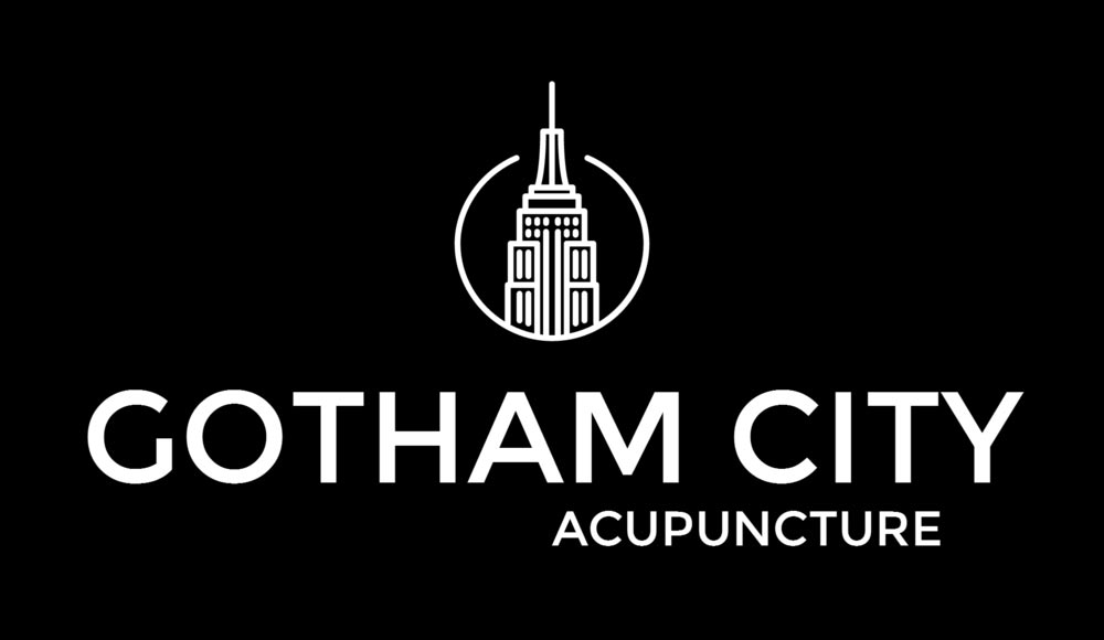
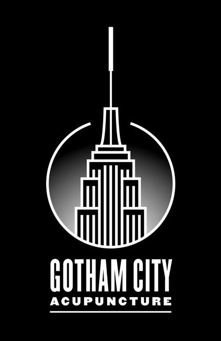
Did I mention my client is a huge Batman fan? Dark logos options were a must.
Gotham City refers both to my client’s location (midtown Manhattan) and his serious love of The Dark Knight (Batman). First up: refining and defining the central icon of the logo, The Empire State. Then I added our needle options.


Did I mention my client is a huge Batman fan? Dark logos options were a must.
Did I mention my client is a huge Batman fan? Dark logos options were a must.
/// On Point ///
/// On Point ///
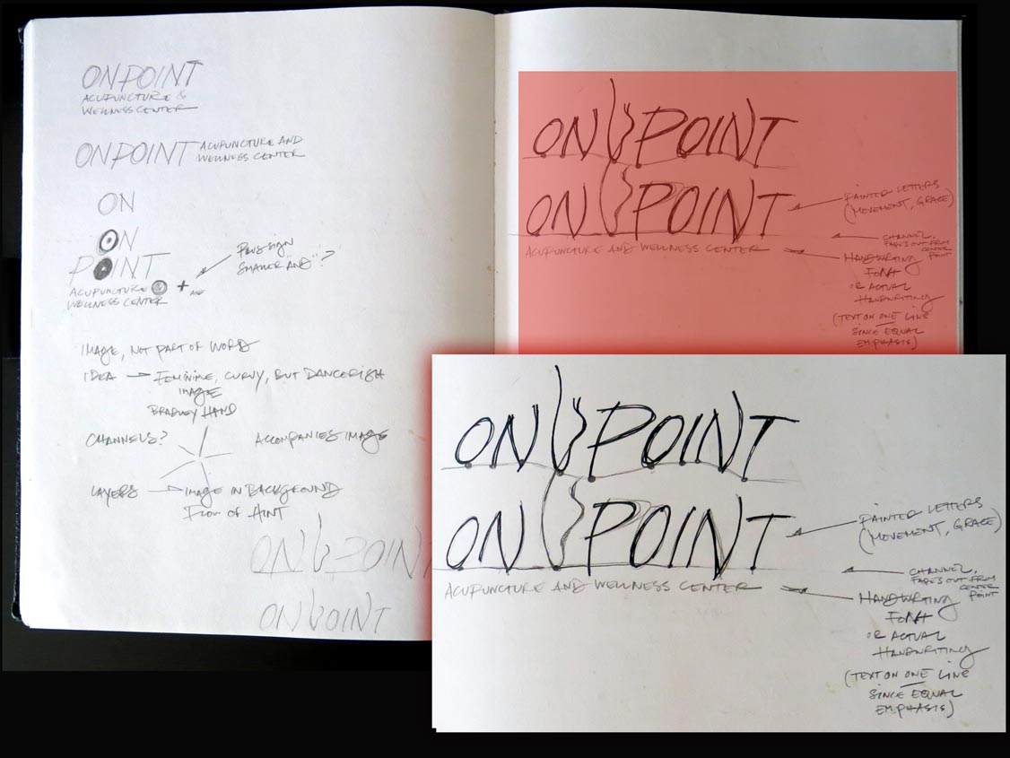
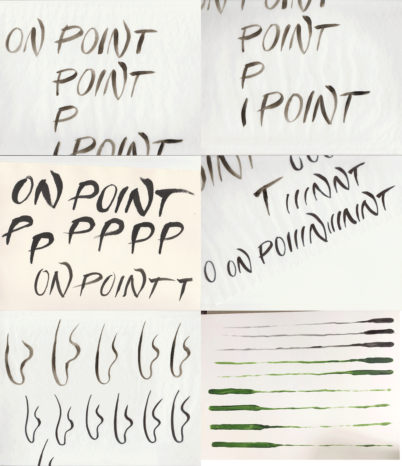
Returned to the Essential Words, scanned through the interview…. Further sketching lead to a decidedly more hands-on and personal approach.
Returned to the Essential Words, scanned through the interview…. Further sketching lead to a decidedly more hands-on and personal approach.

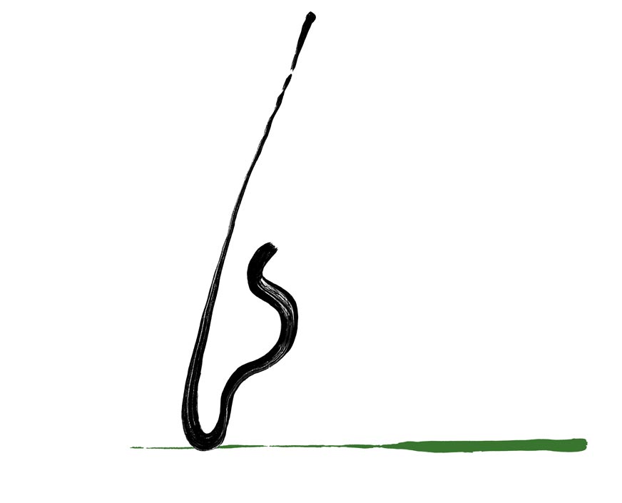
An ex-Broadway and ballet dancer, my client nods to her history with the double-meaning in her business’ name. Creating the “foot” conveyed strong movement and powerful femininity.
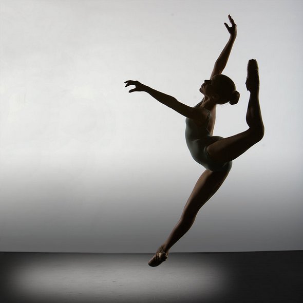
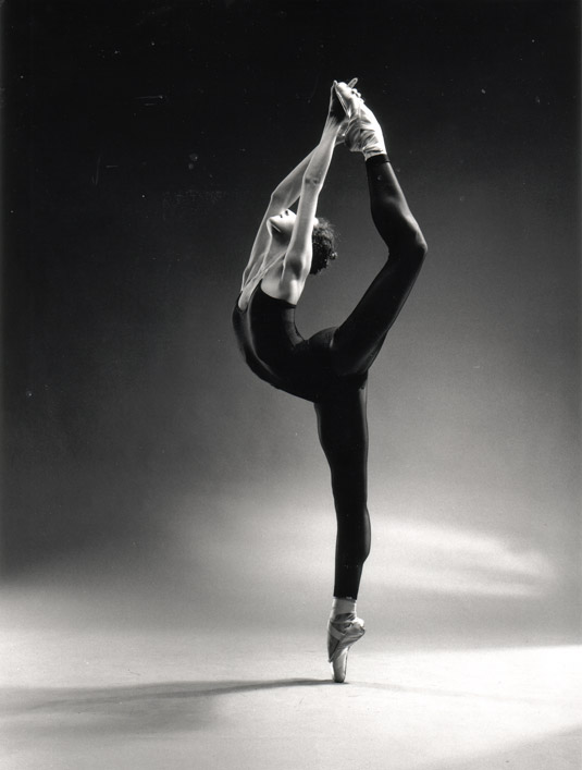
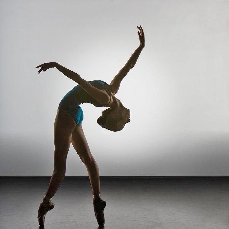
An ex-Broadway and ballet dancer, my client nods to her history with the double-meaning in her business’ name. Creating the “foot” conveyed strong movement and powerful femininity.
Multiple pens, ink, and different papers later… The similarity to Chinese brush work emphasizes the relationship between my client’s work and the foundation and history of acupuncture itself.
Multiple pens, ink, and different papers later… The similarity to Chinese brush work emphasizes the relationship between my client’s work and the foundation and history of acupuncture itself.
/// Gotham City ///
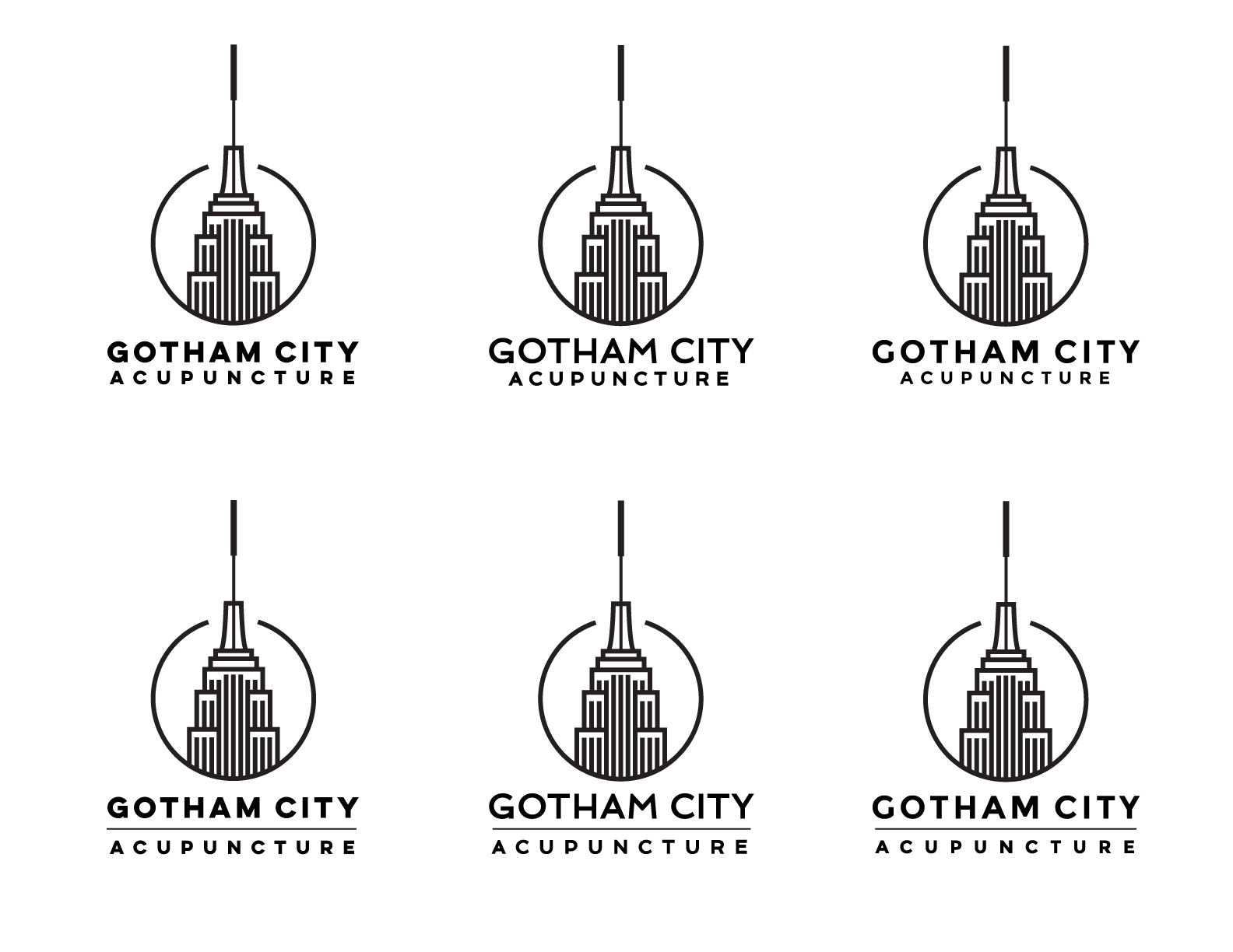
Sometimes you have to go too far in order to find the outer limits of the design. Knowing my client functions best with multiple options from which to choose, I dove in.
Sometimes you have to go too far in order to find the outer limits of the design. Knowing my client functions best with multiple options from which to choose, I dove in.


The extra needles and bursts seemed extraneous and – as my client is more a black-and-grey man – way too colorful. Simpler = better, so we kept the spire and lost the rest.
The extra needles and bursts seemed extraneous and – as my client is more a black-and-grey man – way too colorful. Simpler = better, so we kept the spire and lost the rest.
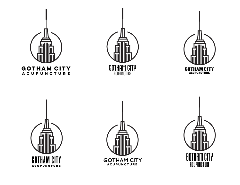
I scoured my font library for typefaces that would compliment our Empire State’s straight lines, as well mirroring acupuncture needles and my client’s straight forward style.
I scoured my font library for typefaces that would compliment our Empire State’s straight lines, as well mirroring acupuncture needles and my client’s straight forward style.


/// On Point ///
/// On Point ///
We’d already placed a symbolic acupuncture needle at the top of her “foot,” but we wanted to underscore it with the shadow as well.
We’d already placed a symbolic acupuncture needle at the top of her “foot,” but we wanted to underscore it with the shadow as well.
/// Gotham City ///
A staple of Broadway marquees, Jonathan Hoefler’s typeface, Champion – now Knockout – subconsciously conveys the bold, gold standard. Since so many of my client’s clients are Broadway dancers, and as he’s located in the heart of the Theatre District, the font match proved ultimately ideal and inevitable.

A staple of Broadway marquees, Jonathan Hoefler’s typeface, Champion – now Knockout – subconsciously conveys the bold, gold standard. Since so many of my client’s clients are Broadway dancers, and as he’s located in the heart of the Theatre District, the font match proved ultimately ideal and inevitable.

/// On Point ///
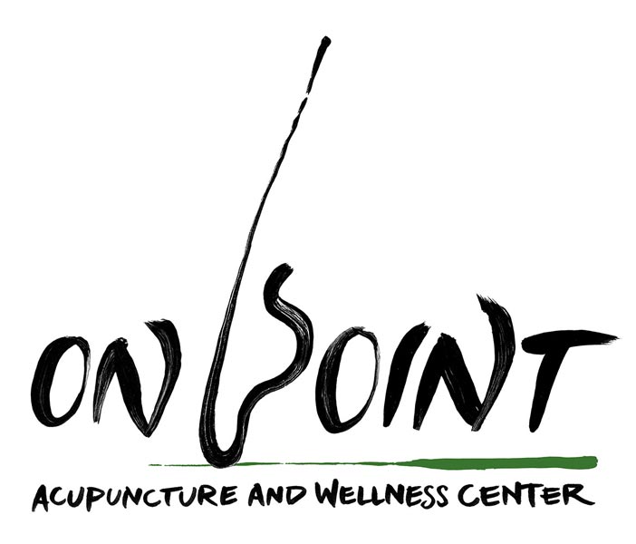
Ultimately, we went with the abstract needle as shadow. The green suggests the organic growth acupuncture promotes. (A color she mentioned in our initial interview - see above, left of gutter, center.)
Ultimately, we went with the abstract needle as shadow. The green suggests the organic growth acupuncture promotes. (A color she mentioned in our initial interview - see above, left of gutter, center.)


We also created a simplified, symbol-only version, to be used for t-shirts, signs and other branding.

We also created a simplified, symbol-only version, to be used for t-shirts, signs and other branding.
